My Heart is a Thousand Colours
My Heart is a Thousand Colours
MY HEART IS A THOUSAND COLOURS: A CONTINUOUS MONUMENT TO COLOUR
After our mother tongue, colour is perhaps, our second language. Unlike words, though, colour enters only through the eyes and is therefore subject to our perception by way of temporal conditions like light, atmosphere, distance, the materiality of the object, and perhaps most importantly, what is next to it. These conditions create distortions that are individual to each of us, yet we share in our experience of them and develop visceral and cerebral preferences and prejudices. Colour’s proximity to other colours especially obfuscates what we call, in painting “local colour” -- the colour of an object without the effects of light and shadow, the casts of other objects, or what our eyes do when colours are grouped. When painting the landscape outdoors, for example, local colour is practically non-existent. Painters en plein air practice long looking -- so they might identify the colours in nature they’re actually observing, as opposed to what their brains have already told them they’re seeing. In other words, snow is never white.

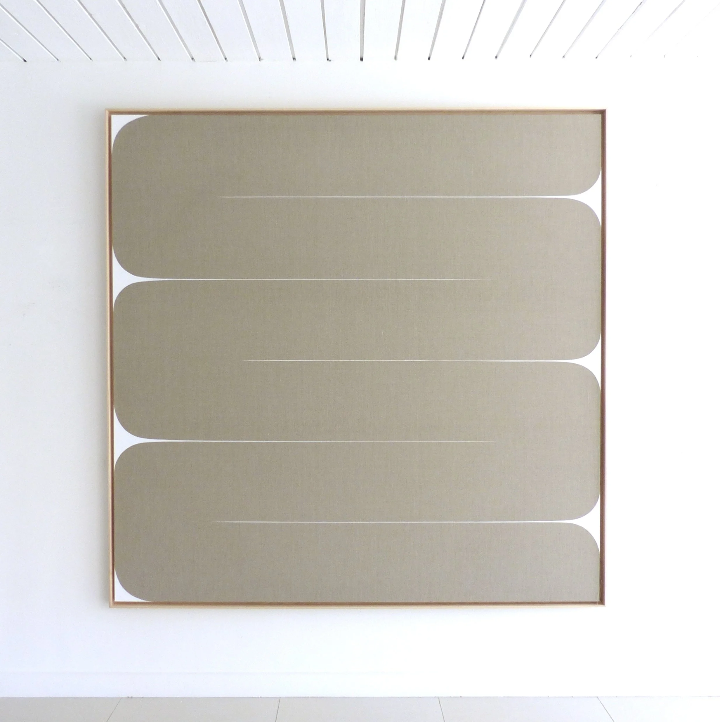
Meet Me at Our Spot, 73.5 x 109.5 inches, Acrylic on canvas, 2021
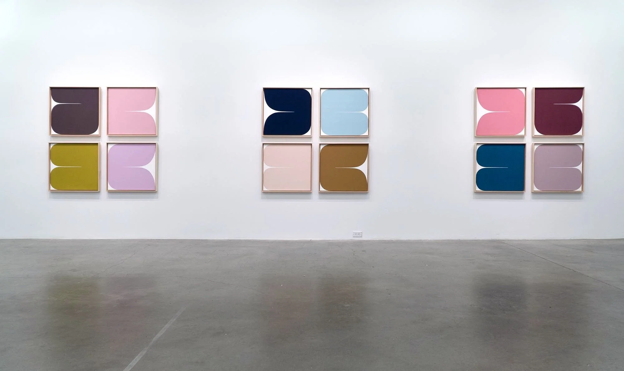
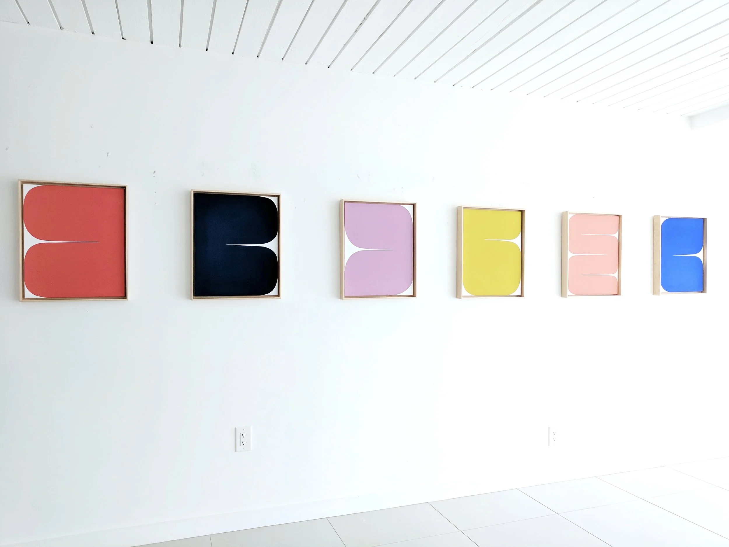
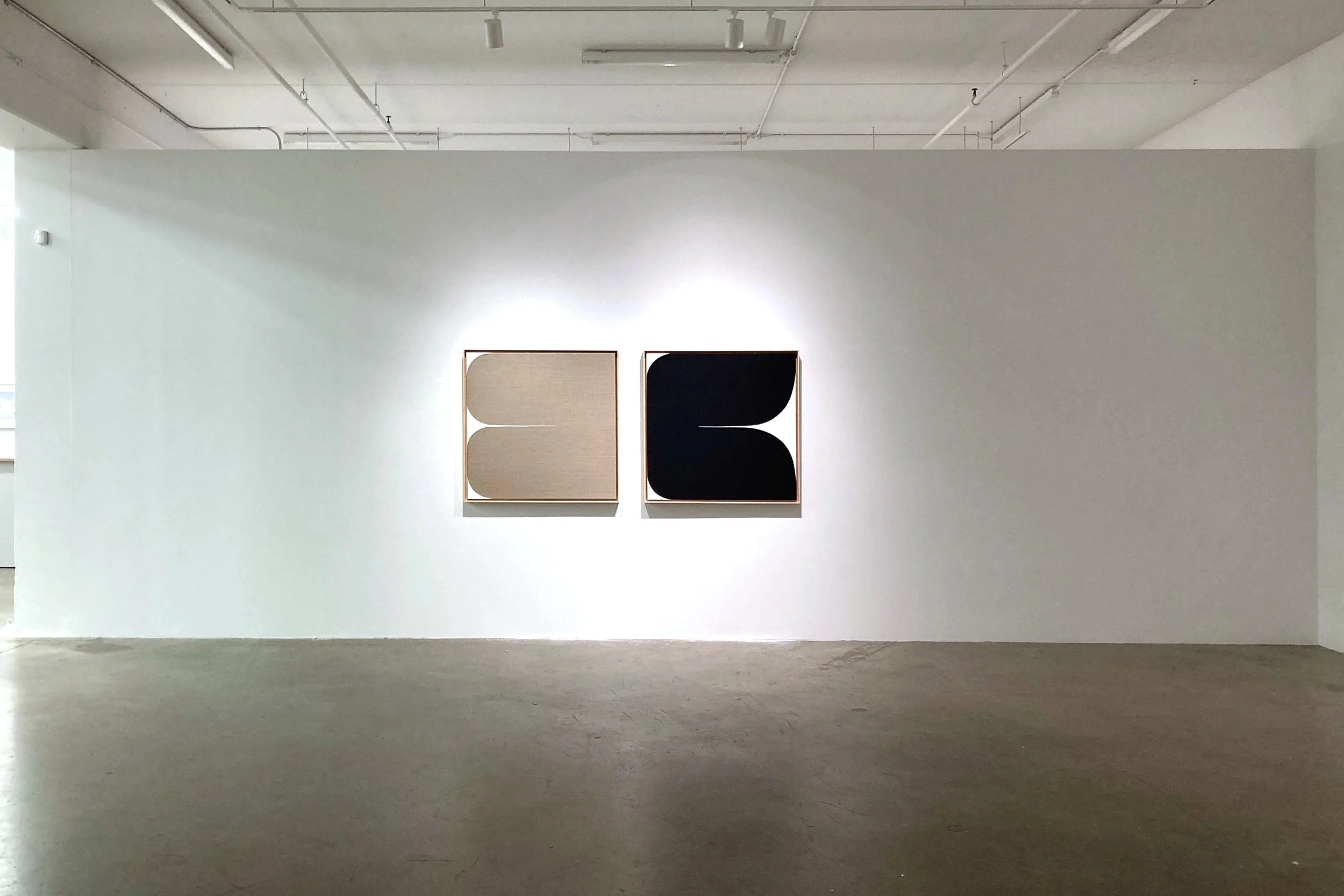
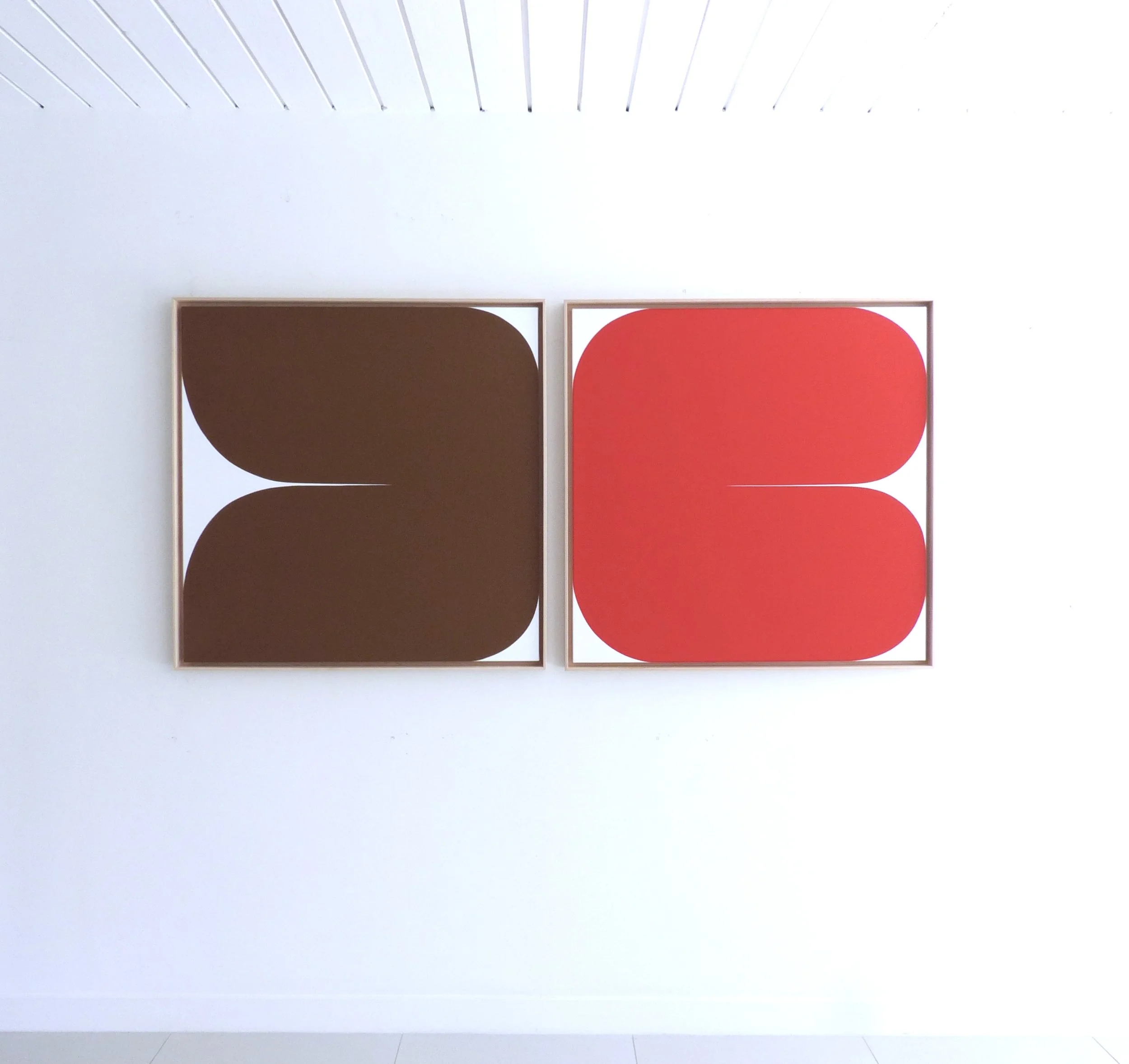
Within these colour concepts, My Heart is a Thousand Colours explores the idea of a “contrapuntal diptych.” In music, “counterpoint” is the relationship between two or more musical lines which are harmonically interdependent yet independent in rhythm and melodic contour. Its use is especially masterful in the compositions of J.S. Bach, but the device is prevalent in many genres. Counterpoint is different from harmony in that it doesn’t ride the same line in order to make one harmonically sound melody, but rather weaves in and out of a dialogue, providing tension with its own voice. A modular and immersive installation of paintings is a striving for a similar vibration and rhythm, plus light bouncing effects, and to conjure a sense of pleasurable longing within opposing intensities in saturation, lightness and darkness and warm and cool associations. It is, perhaps also an effort to stabilize a mutable force; to play at ordering nature while embracing its mysteries. In doing so, we can strive for a delicate joy: in the pleasure of the travelling eye, in reorganization, in preference, in separation and connection, and in togetherness.
"Never let go of the fiery sadness called desire." (Matsuo Basho)
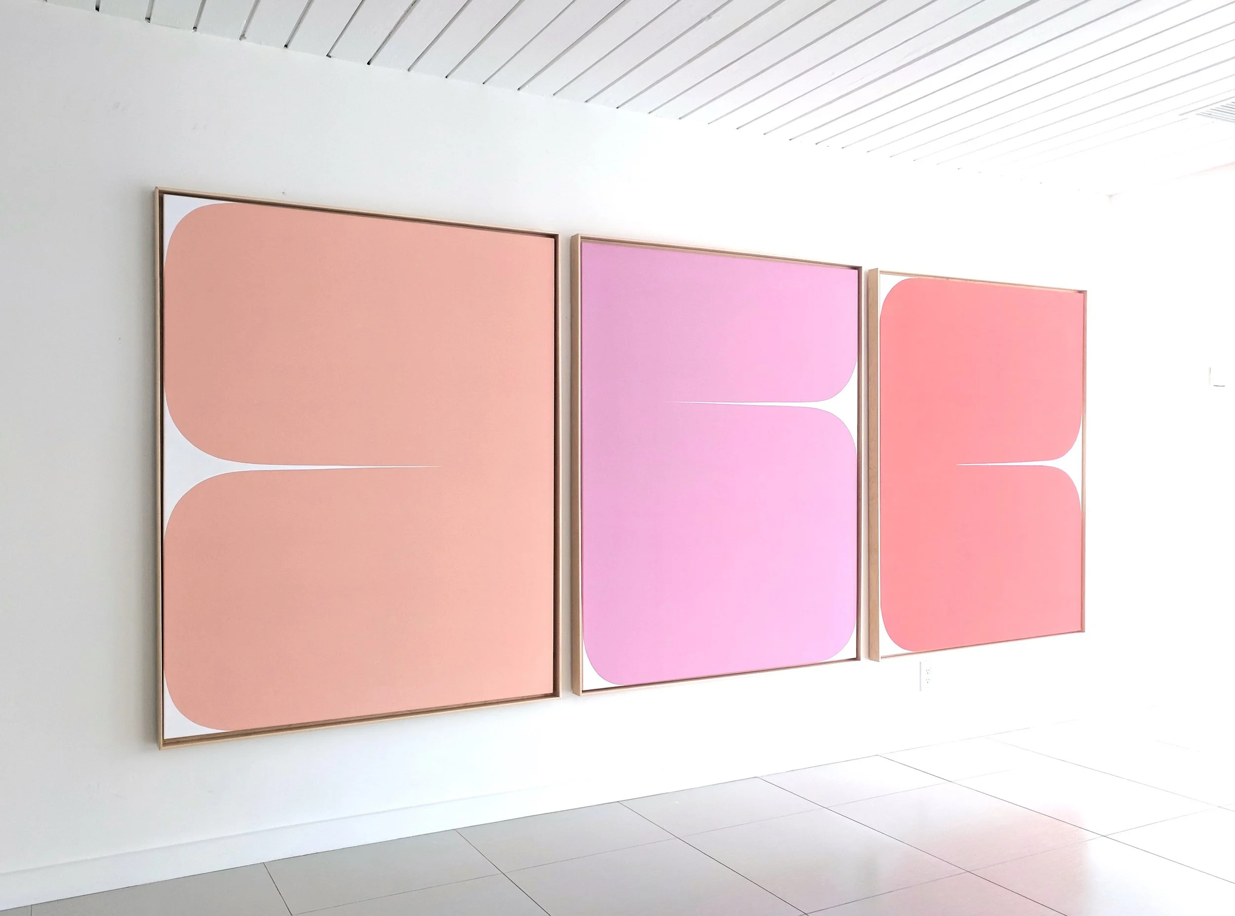
Everything Will Be Okay, (Mother) and (Child), 37.5 x 77 inches, installed, Acrylic on raw Belgian linen and canvas, 2021
GRAPHIC ANALOGIES
(Definition: A comparison between two things that are similar in some ways, but not in others.)
Recently, I met a dealer of antiquities who specializes in pre-Columbian textiles – the term given to work produced “pre-contact” - or before the arrival of Columbus in the Americas, or the time before indigenous groups came into contact with an outside culture. The dealer went to some effort to explain the age and ancient qualities of his treasures. When I remarked upon this, he revealed that rather than discussing archeological context, he preferred to just say, “Isn't this beautiful?” To me, this was confirmation of beauty’s enduring value as one of our most visceral attractions.
When contrasted with random masterworks of American abstraction, these textiles possess all the totemic qualities of graphic tension, color theory, weighting, eye control and rhythm. In every case but one, it’s the paintings that are “pre-contact” – that is, the artist had no knowledge of the textile - suggesting these paintings are intact as unique artworks, and also and more importantly, evidence of the collective subconscious of humanity, rather than moments along a chronological thread of reference or influence. (The outlier is Josef Albers’ 1950-1976 series, “Homage to the Square”; inspired by Albers’ trips to Mexico and his encounters with pre-Columbian art there. Albers made over 1,000 studies, paintings and prints for the series, which explored the subjective experience of color and its relationship to itself.)
Ardent Flame, 37.5 x 77 inches, installed, Acrylic on canvas, 2024
I am struck by the anonymity of the unknown weavers of Mesoamerica, who were most often women. The textiles’ intuitive, exploratory and primal mastery of color concepts feel inextricably linked to my own immersion in color theory and a devotion to the poetry of minimalism. Some questions that have arisen from my encounter with the textiles in person - a vital detail to these revelations - revolve around ideas of authorship and the artist as auteur, ownership and the hoarding of ideas and product, the materiality of objects, the construct of time, essentialism, craftsmanship and the sublime of the hand-made. It also invites a reappraisal of contemporary notions of artistic influence, appropriation, derivation and inspiration. In contemporary art making, I find it easy to resist types of technology that default to fabrication and industrialization; and am instead comforted by attempts to be here now as a conduit for the energies and aesthetic impulses that have pulsed within all of human existence.
Through the archaic technology of painting, I am gaining a deeper understanding of my relationship to all of art, and to my own practice of making art. As a part of the whole, it is possible to transcend textile, to transcend painting, to transcend time and place, and to transcend “artist.”
Let’em In, 73.5 x 73.5 inches, Acrylic on raw Belgian linen, 2022
New Alphabet
New Alphabet
NEW ALPHABET
People think that design is merely about how things look but really, it’s about how things function. We may understand this importance in the context of machines and technology, but the same qualities should be required of all things, especially art. Paintings are made to engage, incite and connect, but they also have the chance to quietly work within the perfection of their own archaic technology.
Having recently set up a studio in a 1960 midcentury house in Palm Springs, California, within spaces of sublime quiet and at the edge of the wilderness of Joshua Tree, the high desert and the San Jacinto Mountains, I’m struck again by the power of a new environment to radicalize the basic principles that have always driven my work: asymmetry, asperity (the roughness or irregularity of things,) simplicity, austerity and intimacy -- all nudging toward a striving for balance, rhythm, harmony and defiant softness. The Japanese aesthetic of wabi-sabi and its principles acknowledge that objects and experiences are most beautiful when they evoke a feeling of spiritual longing.

Moon Woke Me Up Fifteen Times, 67.5 x 93.5 inches, installed, Acrylic on canvas, 2020
My mother’s Japanese heritage and my father’s influence as a Canadian landscape painter have informed my process, execution and themes. My work strives to offer simultaneously, a place of visual shelter and excitement and to occupy space with objects that blur the signifiers of gender, craft and monuments. As much as these works seek to embody colourfield foundations and to straddle the ineffable sensations of weightiness and weightlessness, they’re also concerned with tactile materiality and light- bouncing surface illusions. The super-flatness of saturated void spaces and their edges are meticulously created freehand: no projection, resist or tape is used.
“There is nothing you can see that is not a flower; there is nothing you can think that is not the moon." (Matsuo Basho)
The Plow, The Perch, The Cross, 61.5 x 156 inches, installed, Acrylic on canvas, 2019